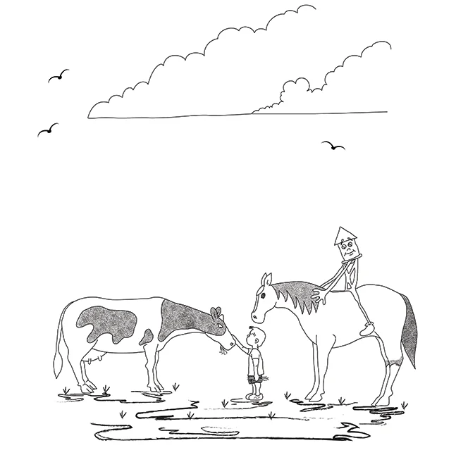
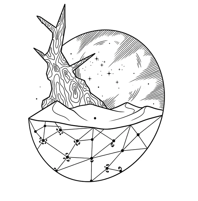
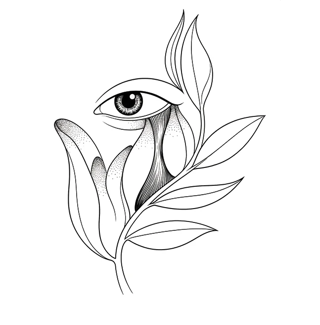
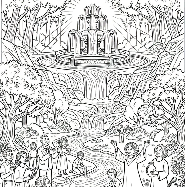
Black and White Book Illustration Made for the Printed Page
Black and white book illustration starts with the book itself: trim size, paper stock, reading age and budget. We match you with the right line artist, agree line art or grayscale, then test the finished drawings at the size readers will actually see.
A Clear Journey From Manuscript to Finished Interior Art
The work moves in five stages. Before final art starts, we agree what the illustrations need to do, how they should reproduce in print, how many pieces are required and which review points are included.
Start with the book, the reader and the print budget
Black and white book illustration works best when it is chosen for a reason, not simply because colour has been removed. We review the manuscript and page plan to see where artwork adds something useful: a chapter opener, a full scene, a small motif or an explanatory drawing. We also look at print cost early, because the right illustration plan has to make sense for the finished book as well as the artwork.
Choose the right line art illustration service for the page
Pure line art and grayscale behave differently in print. Solid black lines reproduce cleanly and are useful for activity books, chapter art and bold interior drawings. Grayscale allows softer shadows and tonal modelling, but paper stock can change how those tones print. We agree the treatment before the first finished drawing so the whole set is built to one standard.
Define the custom scope before the drawing expands
Your written scope records the illustration count, trim size, line treatment, sketch and approval stages, file formats, schedule, revision rounds and fee. Chapter header illustration, full page scenes, spot drawings and cover use are listed separately where needed. That gives you a clear picture of what is included before production starts.
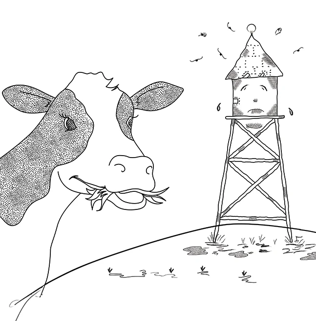
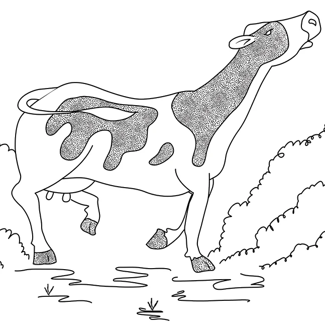
The illustrator starts with rough composition and character poses. Once those are working, we prepare a sample ink line drawing so you can judge line weight, hatching and overall tone before the full set moves ahead. Corrections are made at the stage where they are easiest to fix, rather than after every page has been finished.
Fine hatching can look perfect on a monitor and disappear when a page is reduced. Heavy cross-hatching can do the opposite and close into a dark patch on uncoated paper. We proof the artwork at the final trim size, adjust weak or heavy areas, then prepare print friendly grayscale art or line files in the resolution and colour mode your printer expects.
Cost Effective Interior Illustration Without Guessing at Print
One reason authors choose black and white interiors is practical: mono printing usually costs less than full colour. That can help protect the retail price and royalty margin, but the illustration plan still matters. Page count, trim size, paper stock and drawing density all affect the finished book, so we look at the production numbers alongside the art rather than treating them as separate decisions.
Print cost is only one part of the decision
A cheaper ink option does not automatically make the whole book inexpensive. More pages, larger trim sizes and generous spacing can move the unit cost back up. We look at the interior as a complete production choice so you can see what the artwork is doing to the book before files go to print.
Interior line drawings for books are priced by complexity
A small chapter header illustration, a half page character drawing and a detailed full page scene do not take the same amount of work. Each piece is scoped by what it contains, which keeps the quote tied to the actual drawing rather than a flat rate that hides the difference.
Mixed colour and mono interiors need a cost check
On many print on demand platforms, adding even a few colour pages can move the whole interior onto colour pricing. If you are considering colour plates alongside monochrome interior art, we check the production effect first so the creative choice does not create an unexpected print bill.
The illustration plan stays tied to the book plan
Drawing count, trim size, page count, file preparation and revision rounds all feed into the same written scope. That keeps illustration, interior design and print setup working from the same assumptions.
Interior Line Drawings Prepared for Print, Ebook and Promotion
A drawing made for a printed chapter page may need a different export for an ebook, website or promotional graphic. Print needs enough resolution and the right grayscale or bitmap settings. Small digital uses need strong lines that remain readable after reduction. If artwork is also intended for a cover or marketing piece, we account for those dimensions and safe areas at the brief stage.
Each illustration is created at a suitable working size, then exported for the uses named in your agreement. That may include press ready interior files, screen versions for digital editions, transparent artwork for marketing, or alternate crops for social use. Preparing those versions at the end is much easier when their purpose was known at the beginning.
Ready when you are
Your publishing journey starts here.
Take your book's artwork to the next chapter with Winfrey Publishing. Whether you are holding a finished manuscript, a handful of reference sketches, or just a sense of the mood you want, an illustration coordinator is ready to talk it through. You will get an honest view of what the artwork needs, a written scope before any work begins, and support you can actually reach on the telephone.
How Our Pen and Ink Illustration Service Moves From Brief to Book
STEP01
Hire a Black and White Illustrator for the Right Style
We match you with an illustrator whose existing line work fits the tone of your book, whether you need open outlines, detailed pen and ink, comic influenced drawing or soft grayscale.
STEP02
Rough Drawing and Composition
The first pass is about placement, pose and page balance. You review the roughs before the illustrator commits time to final line work.
STEP03
Sample Ink and Print Test
One approved drawing is taken through to final line or grayscale treatment and checked at your intended trim size. That gives the rest of the project a clear benchmark.
STEP04
Final Line Art and Grayscale
The remaining artwork is completed to the approved standard. Hatching, line weight and tonal areas are adjusted where the print proof shows they need more or less strength.
STEP05
Interior Design Handover
Final drawings are exported in the required formats and checked against the book layout so the artwork sits cleanly with headings, text, gutters and page margins.
How Black and White Book Illustration Can Work Across a Book
Black and White Book Illustration for Clean, Print-Friendly Interiors
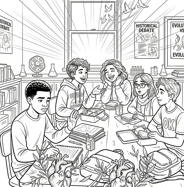
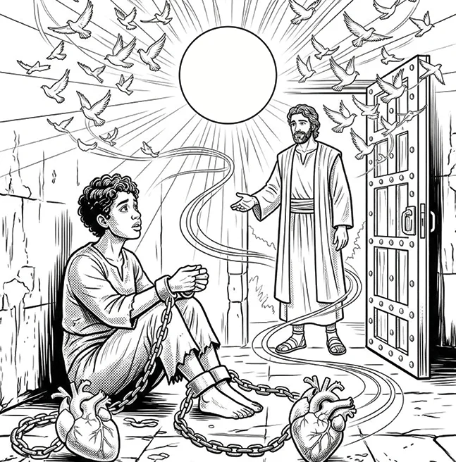
Black and white book illustration gives interiors a clear visual style while keeping production practical. Our line art illustration service can be used for interior line drawings for books, chapter header illustration and other monochrome interior art.
The artwork can include ink line drawing, pen and ink illustration service and print friendly grayscale art. This approach works well when authors need cost effective interior illustration without losing detail or visual character.
If you need a black and white illustrator for hire, the Illustration is prepared around the book’s Interior design, page size and print requirements, keeping the Line art, Pen and ink and Grayscale treatment consistent throughout.
Our commitment
What You Can Expect From Our Black and White Illustrator Service
Good line work matters, but the working agreement matters too. You should know who is managing the job, what stages you approve, what files you receive and what rights are included before a drawing is treated as finished.
A named coordinator keeps the schedule moving, gathers your feedback and carries the work through roughs, sample art, final drawing and file handover.
02
An illustrator matched to the book
We match the illustrator to your genre, reading age and preferred line treatment. You can review relevant work before the project is confirmed rather than discovering the fit after production begins.
03
Ownership stated in writing
Your approved drawings and the rights named in your agreement remain yours. We provide illustration services and do not take ownership of your book or a share of its earnings.
04
Scope, revisions and formats agreed first
Drawing count, line treatment, chapter header illustration needs, trim size, revision rounds, file formats, fees and exclusions are recorded before the work begins.
Illustration styles
Find the Illustration Style That Fits Your Book
There is no single right look for every story. The best illustration
style should feel natural to the book, connect with its readers and
work well in the finished format. We work across watercolor,
character-led 3D, digital painting, cartoon, flat vector, painterly
storybook, black and white, and full-colour interior illustration, so
you can compare different directions before settling on one. If you
already have references or a visual idea in mind, bring them along. We
can help turn that starting point into a clear, consistent illustration
style for the whole book.
They cover the path from manuscript or visual brief to finished interior art. That can include illustrator matching, page planning, rough sketches, a sample inked piece, final line art or grayscale, print testing and final exports for your interior or cover. The exact mix depends on the book, and the scope is agreed before production starts.
There is no useful standard number. A chapter book may use one main illustration per chapter plus small chapter header art. A memoir may need only a few visual moments. An activity title can need artwork on almost every page. We work from the manuscript and proposed layout so the count has a reason behind it.
Usually on the printing side, yes. Mono interiors are generally cheaper to produce than colour interiors, especially through print on demand. The final saving still depends on page count, trim size and platform pricing, so we look at the whole book rather than promising a fixed percentage.
Yes, but the drawing has to carry the mood through composition, line, contrast and white space. Pen and ink can feel energetic, delicate, eerie or quiet without colour. The style works because those choices are deliberate, not because the artwork is simply missing a palette.
It is a small piece of artwork placed at the start of a chapter or section. It can be a character, object, location detail or recurring motif. Because it repeats through the interior, it is a useful way to add visual identity without commissioning a full page drawing for every chapter.
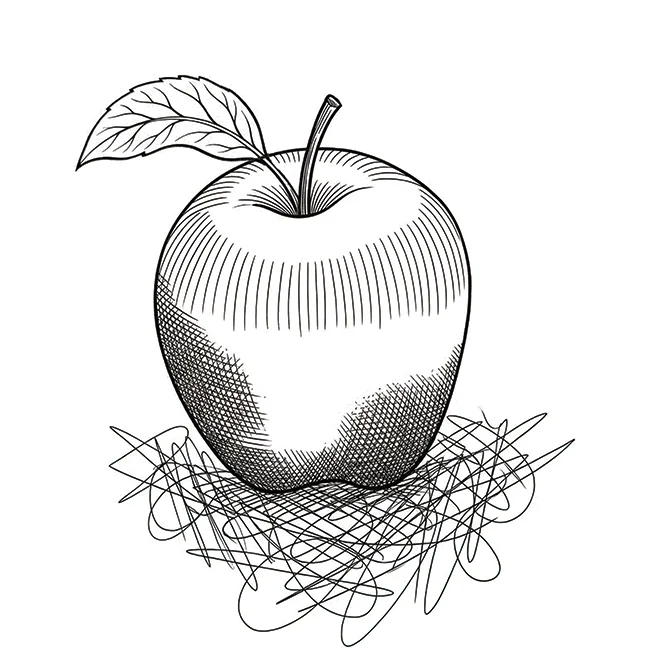
Pen and ink usually relies on solid lines, hatching, stippling and areas of black. Grayscale can also use continuous soft tones and washes. Both are monochrome, but they reproduce differently on paper. We choose the method based on the look you want and the stock your book is likely to use.
Line art is built from solid black and white information, with tone suggested through mark making or line weight. Grayscale includes shades between black and white. Line art is often more forgiving on inexpensive uncoated stock, while grayscale gives softer modelling but needs more care in print.
The number of rounds is written into your scope for the rough stage and final art stage. Changes that stay within an approved composition are normally handled inside those rounds. A new scene, a new character direction or a change from line art to another treatment after approval is additional work.
Chapter books, middle grade fiction, memoir, literary and historical titles, poetry, natural history, field guides, activity books and text led nonfiction can all work well in monochrome. It is especially useful when the artwork supports the reading experience rather than replacing it. A pre reader picture book may still need colour to carry more of the storytelling.
Yes. Mono interiors are widely supported by print on demand platforms and are usually their lower cost interior option. We prepare the files to the required resolution and mode, then the platform carries out its own technical checks before publication.
Because reduction can change a drawing dramatically. Fine hatching may merge into grey, while a delicate outline can disappear on cream stock. We check the art at the intended trim size and adjust where needed so the printed page, not the large monitor view, becomes the standard.
Sometimes. Clean closed line work can often be adapted for colour more easily than dense cross hatching or tonal grayscale art. If a later colour edition, animation or marketing adaptation is possible, tell us during scoping so the files can be built with that future use in mind.
Yes. Uncoated and cream papers absorb ink more than coated stock, which can soften detail and thicken fine marks. Knowing the likely paper helps the illustrator judge how dense the hatching can be and how light the thinnest lines should stay.
You receive the files and usage rights described in your agreement. Winfrey Publishing provides illustration services and does not acquire your artwork or take a share of what your book earns.
Talk to a publishing consultant
Find Out Whether Black and White Illustration Fits Your Book
Use the consultation to talk through your manuscript, trim size, illustration count and print plan. We can help you decide whether you need a full pen and ink illustration service, a handful of chapter header drawings, print friendly grayscale art or a different style altogether. You will leave with a clearer scope before you commit to production.